Survey themes control the visual layout of your surveys to match your brand identity. The theme you choose determines how your survey appears to respondents and affects engagement rates.
Each theme offers unique positioning and display characteristics for various feedback collection scenarios.
Note: Available themes depend on the type of survey you are creating. To get a complete overview of the survey, click here
The theme options are available under the design section in each survey type. Find out the theme types by following the steps:
- Click on survey > create survey > survey type. Enter required details
- Now move to the design section under the survey configuration menu
Note: These steps to find the theme type are the same for all survey types
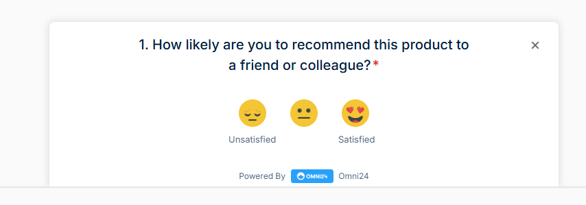
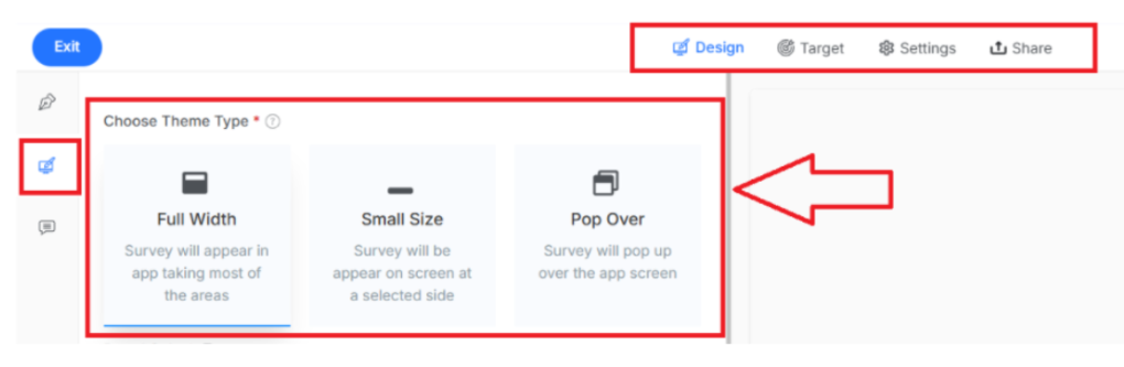
1. In-App Survey
Note: this is available under the design section in the In-App Survey
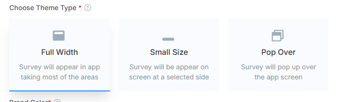
Full Width: Survey displays across the entire width of the application interface, providing maximum visibility.
Small Size: Survey appears as a compact widget positioned on a selected side for minimal disruption.
Pop Over: Survey launches as an overlay on top of the current application screen.
2. Web-Survey
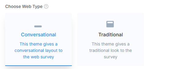
Conversational: Creates a chat-like experience where questions appear one at a time in a list format.
Traditional: Displays questions in a standard form layout with everything is visible on a single page.
Note: For the Email survey, no themes are available.
You can also preview your survey theme for the preview section before launching to match it with your brand